
How Gothic Cathedrals Used UX Design (Before It Was a Thing)

Walk into a Gothic cathedral and your senses are immediately under command.
Your eyes go up. Your feet slow down. Light pours in like a divine spotlight.
You feel something—whether or not you believe in anything at all.
None of that was accidental.
These buildings were meticulously designed to guide people through a visual, emotional, and spatial journey.
They created awe on purpose.
They directed traffic before signage existed.
They used color, height, shadow, and rhythm to tell a story without words.
Sound familiar?
That’s user experience design.
Not with buttons or wireframes—but with intention, emotion, and architecture.
Wait—wasn’t UX a modern invention?
Not quite. The term user experience was coined in the 1990s by cognitive scientist Don Norman, while working at Apple. He wanted a phrase broad enough to describe the entire emotional and functional journey a person has with a product.
But the principles behind UX? Those go way back.
Long before we had screens or software, artists and architects were designing experiences—with layout, symbolism, and light. Think Gothic cathedrals. Think comic books. Think of anything that makes you feel something while guiding your attention.
From cathedrals to comics: humans love a guided story
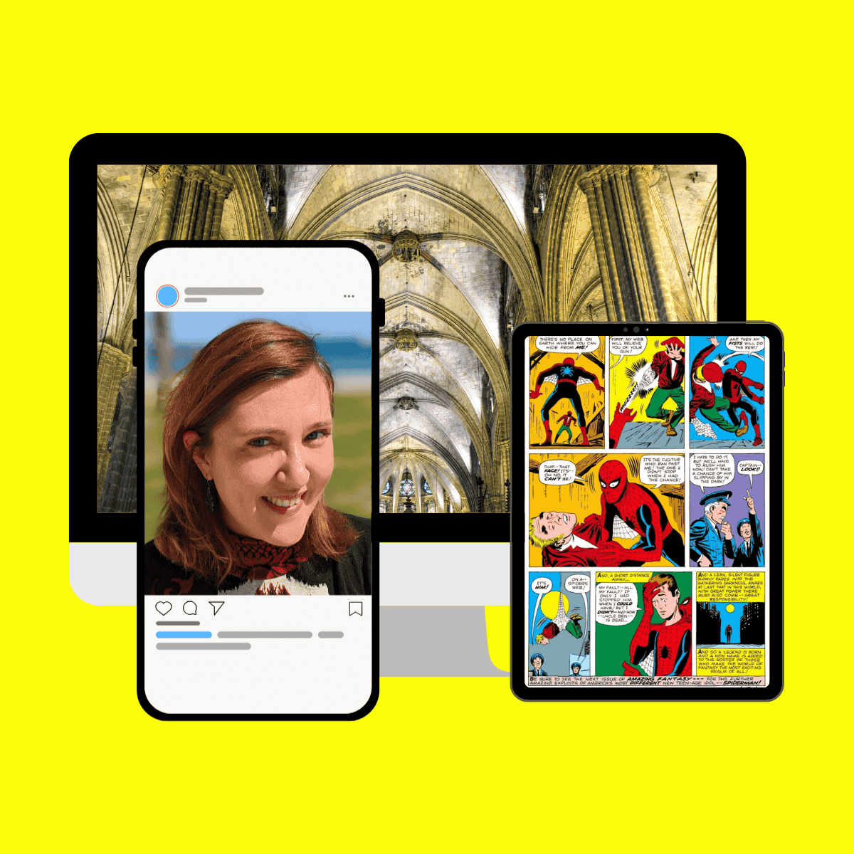
It’s not just cathedrals.
Pick up a comic book and you’ll notice the same choreography: the page leads you through suspense, laughter, and resolution, panel by panel, eye movement carefully considered.
That logic—guiding a non-literate audience through narrative visuals—isn’t modern either.
In fact, the stained glass windows and sculptural panels in Gothic churches were among the first sequential visual narratives. Saints, miracles, and moral tales (many inspired by Jacobus de Voragine’s Golden Legend) were broken into visual “frames” to be read by the eye, long before most people could read text. The Church mastered visual storytelling because it had to. If you wanted people to understand, believe, and remember, you showed them.
That’s storytelling UX at its most primal: emotional clarity, visual flow, and purposeful design.
Steve Jobs didn’t invent UX design.
What he did was make it central to business.
He proved that design wasn’t just about how something looks—it’s about how it works, how it feels, and why that matters.
Marketing takeaway
Great UX isn’t new.
It’s ancient. It’s human. It’s all about designing with a sense of wonder.
If your brand or product doesn’t just work, but feels like something, people will remember it.
📚 Further Reading
Want to dive deeper into the roots of visual storytelling and user-centered design? These three books connect the dots between art, perception, and strategy:
1. The Power of the Center – Rudolf Arnheim
How visual composition creates meaning. A brilliant lens on how architecture and layout shape emotion.
2. Understanding Comics – Scott McCloud
A comic book about comic books—and a masterclass in guiding attention, sequencing, and visual narrative.
3. The Design of Everyday Things – Don Norman
The foundation of UX thinking. Clear, witty, and essential for anyone interested in how humans interact with design.
✨ From ancient art to modern marketing—this series explores what visual persuasion can teach us, then and now.
✍️ Written by a content strategist who still thinks like an art historian.
I’ve always believed that marketing becomes more human—and more fun—when you zoom out. With a background in art history, I see visual strategy everywhere, from ancient statues to modern branding. This series connects the dots between the past and the present, between how we’ve always communicated and how we do it now.